|
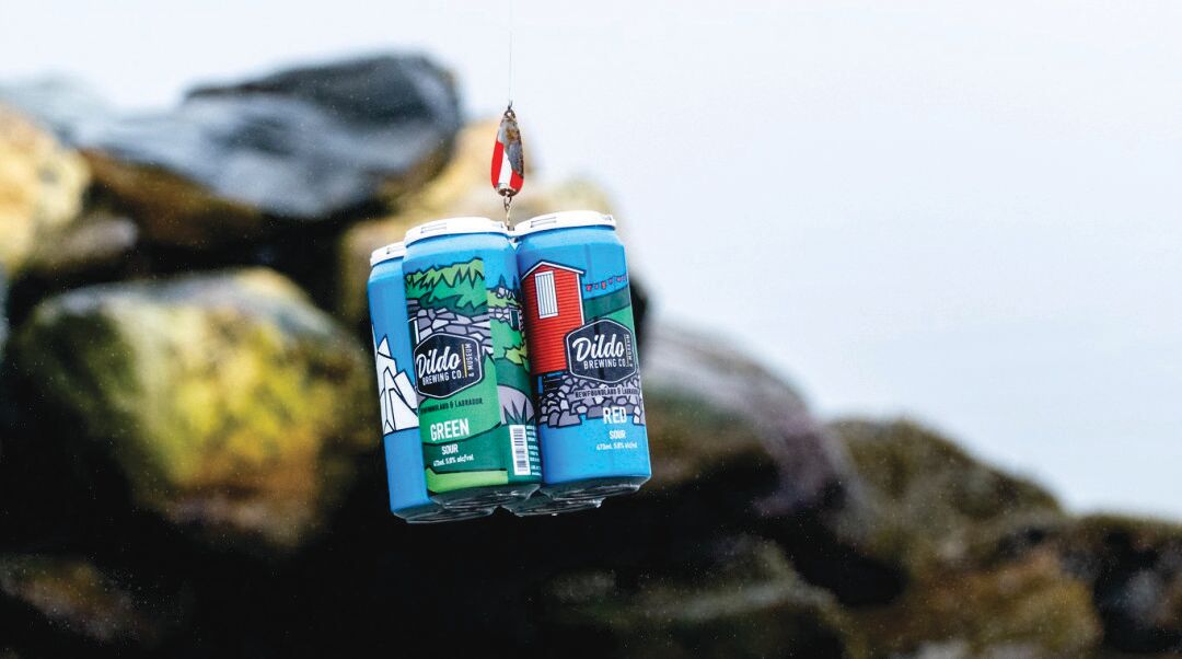
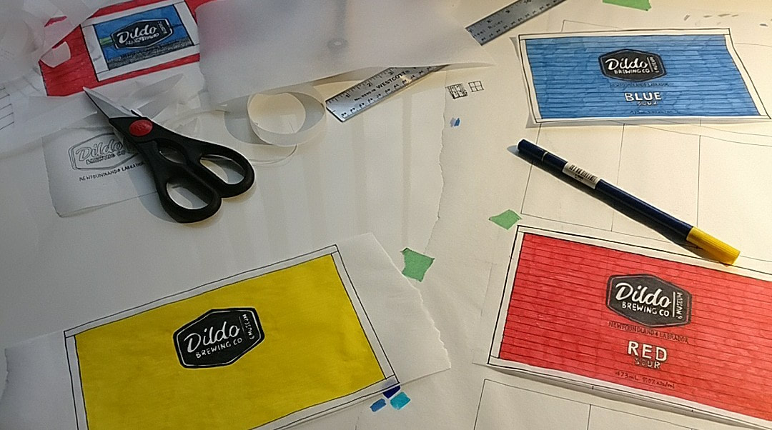
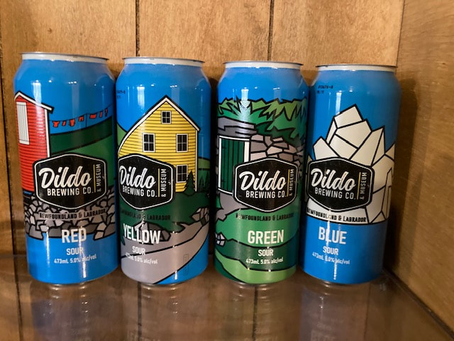
You never know what’ll happen when you put yourself out there. About a month after A Sense of Place finished its run at Two Whales Coffee Shop, I received an interesting email from someone who’d seen the show. He thought the graphic style of my paintings and the way I represented the landscape and vernacular architecture of rural Newfoundland would be a great fit for a project he was planning. Turns out it was the Brewmaster at Dildo Brewing Company, and he wanted to know if I’d like to design the labels for a special edition 4-pack he was going to create. Yes b’y, s’pose I would. The concept was simple: four unique sour beers, each pouring a different hue: red, yellow, green, and blue. My job: come up with a coherent theme to unify the four beer colours, make sure it was relevant to the rural roots of the brewery, and figure out how to do it within the odd dimensions of a tall-boy beer can. I’d never designed a beer label before, but I was game to try it. First, the theme. That was simple enough, or so I thought. Rural Newfoundland and Labrador is full of small wooden buildings, wooden wharfs, and wooden boats. Horizontal lines and bright colours are everywhere “out around the bay.” I quickly came up with a concept I really liked, but decided it was a bit too minimalist for this project. I stashed it safely away for another time and went back to the drawing board, literally. I sketched, looked through my photo archives, sketched some more, and maybe would’ve pulled my hair out in frustration if I had any. Any time I’ve designed anything - from a tattoo to a painting to a building – there’s a painful bit in the middle when it seems like a solution is impossible. This is the part where I want to quit, but from experience I know the only way out is to plant my arse in the chair and draw my way out. It happens every time, and it works every time. As I drew, my hand and my mind started to loosen up. Unlike the proverbial “lightbulb moment”, creative ideas rarely pop up out of the blue. It takes consistent effort over time. Words, thoughts, and half-formed ideas drifted through my head as discarded trace paper accumulated on my desk like drifting snow. Then, finally, one word: Icon. Suddenly it all came together. Four iconic symbols: shed, saltbox, cellar, and iceberg. Sheds are everywhere on the East Coast of Canada, and I’d painted or drawn plenty. Ochre red was historically used to paint these little buildings, and red remains a very popular colour choice today. The red beer label was a no brainer – red sheds are true Newfoundland icons. 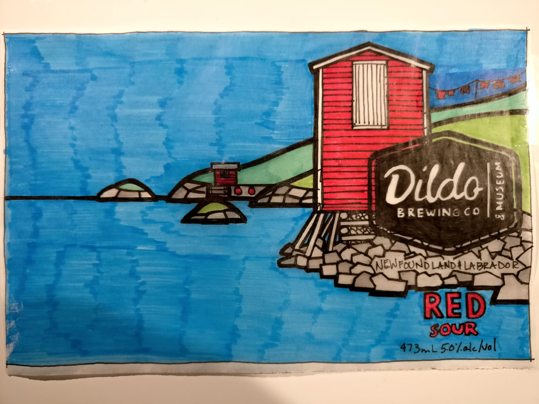 Saltbox houses are also instantly recognizable symbols of rural Newfoundland. (Sidebar: often confused with biscuit box houses, saltboxes have steeper roofs than biscuit boxes). Usually painted white, saltboxes can actually come in any combination of colours. The yellow beer label features a saltbox that matches the yellow of the Dildo Brewery Company building and another famous Newfoundland icon, the dory. Root cellars were traditionally found all over Newfoundland. Used to preserve winter-hardy vegetables such as potatoes, carrots, and turnip, cellars became less common as modern refrigeration and supply chains improved the year-round availability of “fresh” produce - if a tomato that’s traveled up the length of North America by truck, crossed the Gulf of St. Lawrence on a ferry, and been on at least two more trucks before getting to a store shelf can still be considered “fresh”. But I digress… Many people still prefer to grow and keep their own vegetables in cellars. I have memories of getting potatoes from my grandmother’s cellar, and being terrified of spiders, centipedes, bats, the dark, and whatever else was lurking in there! Being mostly in the ground, only the door and a bit of the front wall is visible. Green cellar doors, surrounded by grass, trees, and shrubs do the heavy lifting for this beer colour. Blue was tricky.
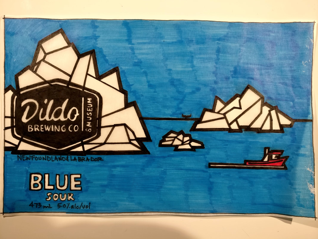
It seems to me at least, that blue is a less used paint colour on the East Coast. Maybe it was historically less available versus red or yellow and didn’t catch on as a traditional paint choice. Maybe it was more expensive. Or maybe other colours are preferred because they’re easier to spot in the fog or next to the water, I’m not sure. I’ve heard legends about blue skies occurring in Newfoundland, and I’ve even witnessed a few of these myself. When they do happen, they are truly stunning. In fact, there are few things finer than being in a boat on a calm, clear day, with the blue sky reflecting off the blue water, and nothing else on the horizon. The only problem with this scene is that a completely blue label (besides being painfully boring) lacks a sense of place. Cue the icebergs and whales. While the icebergs speak for themselves, whales have a very unique connection to this little part of the world. Up to the early 1970s, the Dildo area used to be a whaling station. If you drive through the community you can see evidence of this industry: some homes have whale jawbones stuck vertically into the ground to create an arched entrance to their property, and I know of at least one whale harpoon that adorns the front lawn of a house there. Apparently, there’s even a scuba dive site where massive bones still litter the ocean floor. Fortunately for the whales and to the delight of tourists, times have changed. Nowadays when boats go out to shoot whales, they’re using cameras. The blue can nods to Dildo’s whaling past, and to our current understanding that these magnificent animals are far more valuable out in the ocean (alive!).
1 Comment
Last fall, in the midst of lockdowns, I began a series of paintings for an exhibition scheduled for July of this year. Without knowing what the world would look like so far in the future or if the show would even happen, I decided to err on the side of optimism and got out my brushes. In November of 2021, just as I began to paint, the province of Newfoundland and Labrador announced that 2022 would be designated a Come Home Year. Former residents and curious Come-From-Aways would be invited to experience the people, places, and culture that make Newfoundland and Labrador so compelling. The creaky machinery of the tourist industry was dusted and greased, and the icebergs and humpback whales were pulled out of storage and sent back to work. While I painted, the Covid situation began to improve, and by the time I’d finished the seventh and last piece in the spring of 2022, the world was starting to open up again. In March I made my first trip back home in two and a half years. Reconnecting with my family, spending time in the woods, and seeing the Atlantic Ocean again felt like vitamins that my soul had been deprived of for far too long. After so much isolation, uncertainty, and loss during the pandemic, it was as if someone had pulled up the black-out blinds and opened a window to let the sunlight and fresh air back in. I am part of the target demographic for Come Home Year. I grew up on the Bonavista Peninsula in the pre-Internet era, before the flashy television ads, world-class hotels, and Broadway musicals put Newfoundland and Labrador on the global tourism map. Twenty five years ago I joined the thousands before me who left to seek education and employment on the Mainland. When I visit nowadays, I see my home province as a tourist, an architect, and a former resident who still calls it home. With this series of paintings, I wanted to present the things that I find meaningful when I Come Home. Water, rocks, trees. Colourful wooden buildings set in a sparse and beautiful landscape. Solitude. Quiet contemplation. And yes, even an iceberg. Extraneous details and distractions have been stripped away, along with perspective, shadows, and textures. In the end, each painting contains only what it needs to convey A Sense of Place. A Sense of Place This house sits on a grassy field in Elliston, NL, just a few feet from the edge of the North American continent. Every spring, a parade of icebergs floats by, drawing tourists and locals alike. I composed a close-cropped detail of what I imagined the original exterior looked like, and I painted the house yellow because it reminded me of an old house where I grew up. A Roof Over Our Heads #1 Centered precisely on the broad side of an immaculately kept shed in Twillingate, the little birdhouses are exhibited like colourful paintings on a white expanse of gallery wall. A simple fence with just two horizontal boards defines the property and frames the subjects. A Roof Over Our Heads #2 Four brightly painted birdhouses are located underneath the overhang of a white shed. The birdhouses are residents in the same way as the birds themselves, sheltered from the elements by the structure above them. Beach House It wasn’t until I moved away to Alberta that I heard of the Devil’s Footprints in Keels, NL. Concretions within an exposed bedrock cliff face had eroded away, leaving impressions in the rock. After finding these “tracks”, I wandered around the rocky beach and admired an old house with a unique curved roof. It was a gloomy, wet day, and the photo I took was essentially black and white. A familiar yellow house brightens up the scene, as does a beach full of rainbow-coloured rocks that reminds me of a trip to Gros Morne National Park. Good Luck Charm Fishing villages on the East Coast have seen excruciating changes in the past few decades as fish stocks dwindle and people move away to find more stable work. Moreton’s Harbour is no exception. There is still some fishing being done, but the old wooden buildings, many now neglected and crumbling, provide a glimpse into the industry in its prime. A superficial interpretation of a horseshoe over the door can be a humourous poke at the lack of stairs to the second floor, or a deeper commentary on hope and loss. Walk-out Basement The Old Salt Box Company is doing a great job of tastefully modernizing historic houses in rural Newfoundland and turning them into unique accommodations for travelers. On a trip to Fogo Island, I stayed at one of their properties in Herring Neck, near Twillingate. The cove on the opposite side of the road was dotted with wharves, boats, and little sheds, including one with an interesting storage area surprisingly close to the water. I imagine this “basement” has taken a few beatings from the Atlantic Ocean over the years. Winter Walk
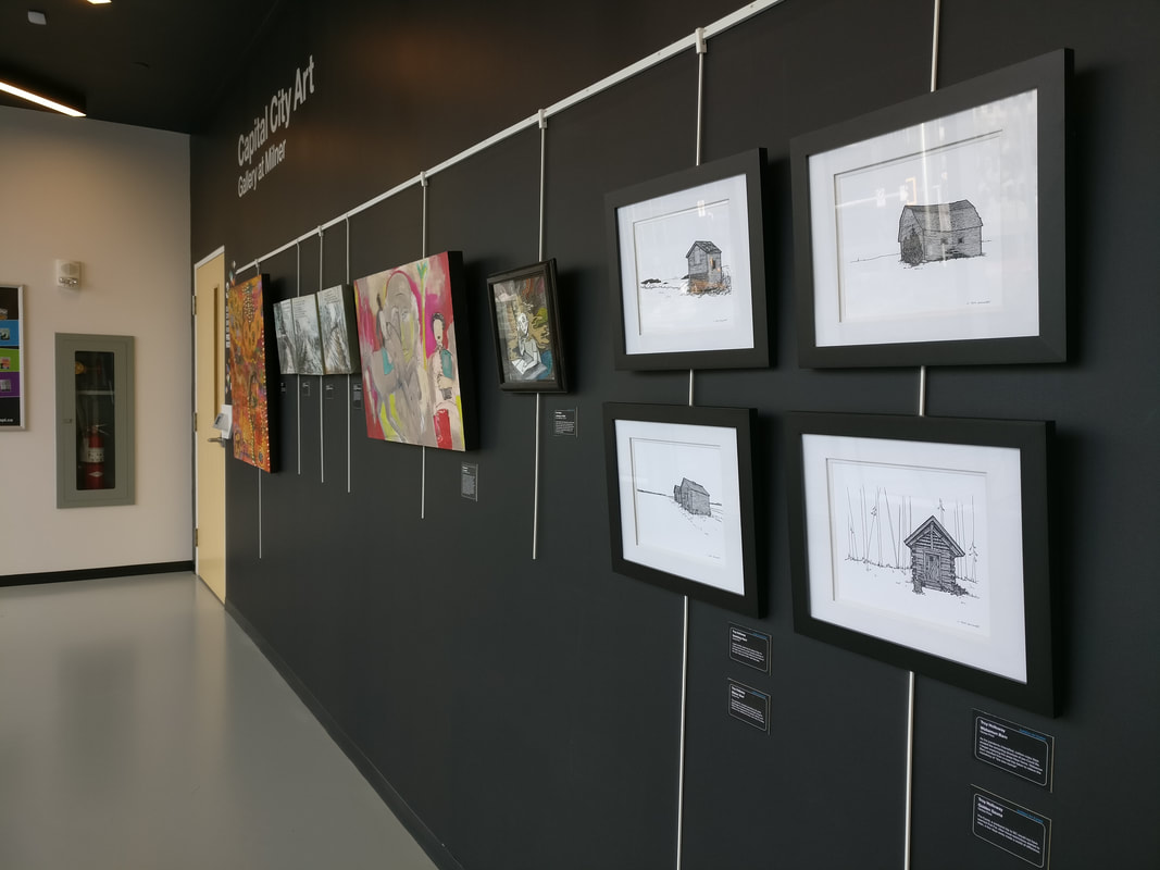
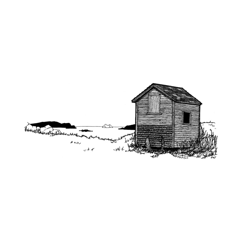
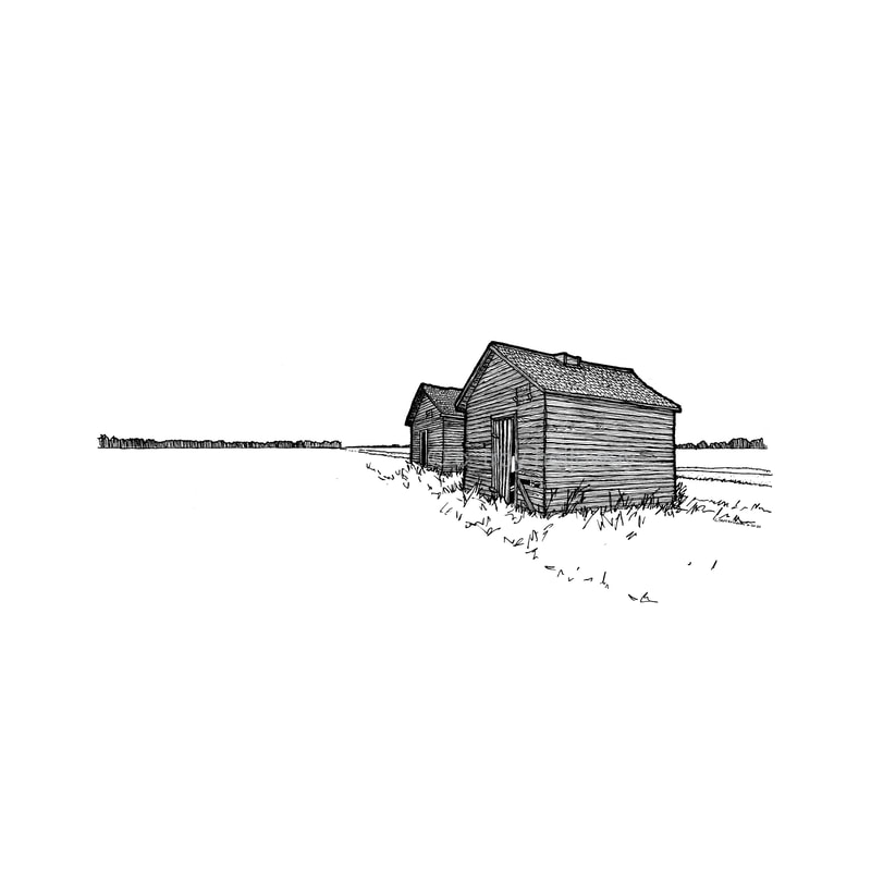
The Champney’s Aquarium is tucked away in a little cove near the popular Fox Island Hiking Trail. Featuring an assortment of exhibits and touch tanks, the aquarium and surrounding community is a growing destination for visitors. A new boardwalk to the beach was being built when I last visited; a winter scene proved to be the right approach to emphasize its meandering path and the slope of the nearby hills. A little red shed adds a pop of colour and serves as an anchor point for the composition. A Sense of Place will be exhibited during the month of July, 2022 at Two Whales Coffee Shop in Port Rexton, Newfoundland. I am excited to host the Artist Reception on Saturday, July 16th from 6 to 7pm at Two Whales. -Troy Way back at the end of 2021, a call for artists was sent out from Edmonton Public Libraries for an exhibit of work done while the world was locked down during the Covid-19 pandemic. Like so many of us, the travel constraints put in place to reduce the spread of the virus gave me an excellent opportunity to reconnect with my art, and I jumped at the chance to show people what I'd been up to. Over two years, I reconnected with my love of making art. I experimented with watercolours, acrylics, ink, and graphite. I built the hollowaystudio.com site that you're visiting right now, and I tried my hand at print-on-demand platforms for my pop-art material. I found great local printers to reproduce my work, and I tried a ton of frame and mat combinations until I figured out what really made my drawings pop. I began selling my work online, and at Two Whales Coffee Shop in Port Rexton, Newfoundland. While my ability to travel and find inspiring subject material during this time was severely limited, I traveled back in time as I sifted through years of photos I'd taken on my visits to Newfoundland and on road trips throughout Western Canada. Out of thousands of photos in my files, a few dozen caught my interest. I've always been fascinated by small wooden buildings: the textures of weathered wood, the reshaping of form by the elements, and the resilience of these humble structures to withstand the patient and persistent march of time. I began drawing. First in graphite, using tone and shading techniques to capture the qualities of light and texture, and then in ink. I traded my pencils for technical pens with nibs and fine as sewing needles. The constraints of my small sketchbook forced me to choose what details to show, and what to edit out. In the end, the process of trying, failing, succeeding, and learning is what drives me to make art. I started my lockdown drawing journey with no goal other than to consistently "do the work", as Steven Pressfield puts it. As the drawings started to pile up, I saw a definite style emerging. I learned to render materials and wood grains, applying architectural linework techniques to emphasize outlines, details, and depth. When the call for artists came out, I knew there was enough material in my portfolio to put together an exhibit, but I needed a theme to tie everything together. I pulled together four images that showed not just that I'd created art during the lockdown, but images that expressed my personal experience of the pandemic. Near/Far Covid-19 shrunk my personal sphere of existence down to a tiny dot. Conventional notions of distance and time were replaced by isolation and uncertainty. Travel restrictions kept me close to Edmonton, where I used the time to reconnect with my art. Near/Far reflects my pandemic experience: isolation, boredom, discovery, and hope. Elliston Shed The pandemic changed everything. My yearly pilgrimages to Newfoundland abruptly stopped. Elliston Shed represents the people, places, and culture of my childhood home, now very Far away. Wabamun Barn As the pandemic intensified, carbon-copy days eroded the remaining structure of pre-Covid life. I began exploring the areas Near home. Wabamun Barn resulted from a road trip taken to relieve the monotony of "the new normal". Vanishing Point I spent months exploring the places Near me. I discovered that the small wooden buildings of the West were not all that different from those of the East. Vast green fields, vast blue seas. Golden Sauna
Pre-Covid, a weekend trip to British Columbia would not have seemed that Far. After travel restrictions started to relax, a few days away made a world of difference. As the last of the snow melts and the pandemic appears to be fading away with it, I'm grateful to have had the opportunity to turn the constraints of the past into a body of work that will inform and inspire my future art and travels. I'm looking forward to redefining what Near and Far mean to me in a post-Covid world. Isolation Art runs from January to March 26, 2022 at the Stanley Milner Library in Edmonton, Alberta. -Troy |
TroyPictures and words Archives
December 2022
Categories |






 RSS Feed