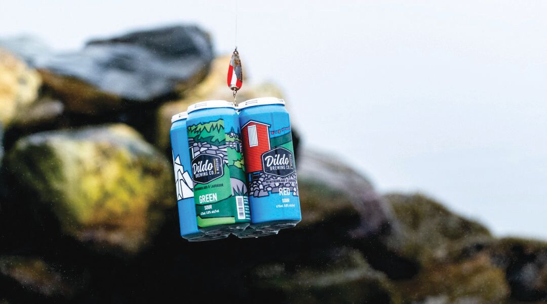
 Photo Credit: Dildo Brewing Company You never know what’ll happen when you put yourself out there. About a month after A Sense of Place finished its run at Two Whales Coffee Shop, I received an interesting email from someone who’d seen the show. He thought the graphic style of my paintings and the way I represented the landscape and vernacular architecture of rural Newfoundland would be a great fit for a project he was planning. Turns out it was the Brewmaster at Dildo Brewing Company, and he wanted to know if I’d like to design the labels for a special edition 4-pack he was going to create. Yes b’y, s’pose I would. The concept was simple: four unique sour beers, each pouring a different hue: red, yellow, green, and blue. My job: come up with a coherent theme to unify the four beer colours, make sure it was relevant to the rural roots of the brewery, and figure out how to do it within the odd dimensions of a tall-boy beer can. I’d never designed a beer label before, but I was game to try it. First, the theme. That was simple enough, or so I thought. Rural Newfoundland and Labrador is full of small wooden buildings, wooden wharfs, and wooden boats. Horizontal lines and bright colours are everywhere “out around the bay.” I quickly came up with a concept I really liked, but decided it was a bit too minimalist for this project. I stashed it safely away for another time and went back to the drawing board, literally. 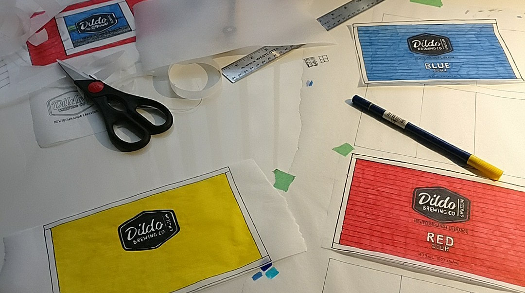 I sketched, looked through my photo archives, sketched some more, and maybe would’ve pulled my hair out in frustration if I had any. Any time I’ve designed anything - from a tattoo to a painting to a building – there’s a painful bit in the middle when it seems like a solution is impossible. This is the part where I want to quit, but from experience I know the only way out is to plant my arse in the chair and draw my way out. It happens every time, and it works every time. As I drew, my hand and my mind started to loosen up. Unlike the proverbial “lightbulb moment”, creative ideas rarely pop up out of the blue. It takes consistent effort over time. Words, thoughts, and half-formed ideas drifted through my head as discarded trace paper accumulated on my desk like drifting snow. Then, finally, one word: Icon. Suddenly it all came together. Four iconic symbols: shed, saltbox, cellar, and iceberg. Sheds are everywhere on the East Coast of Canada, and I’d painted or drawn plenty. Ochre red was historically used to paint these little buildings, and red remains a very popular colour choice today. The red beer label was a no brainer – red sheds are true Newfoundland icons. 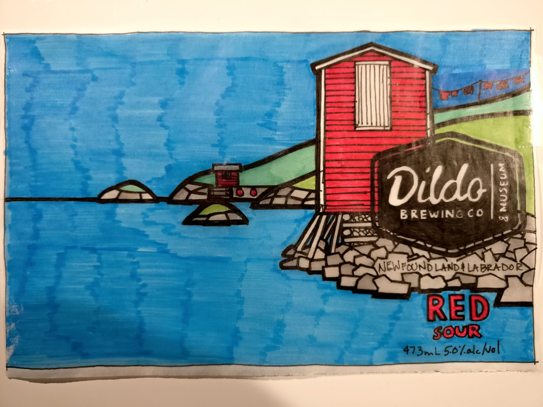 Saltbox houses are also instantly recognizable symbols of rural Newfoundland. (Sidebar: often confused with biscuit box houses, saltboxes have steeper roofs than biscuit boxes). Usually painted white, saltboxes can actually come in any combination of colours. The yellow beer label features a saltbox that matches the yellow of the Dildo Brewery Company building and another famous Newfoundland icon, the dory.  Root cellars were traditionally found all over Newfoundland. Used to preserve winter-hardy vegetables such as potatoes, carrots, and turnip, cellars became less common as modern refrigeration and supply chains improved the year-round availability of “fresh” produce - if a tomato that’s traveled up the length of North America by truck, crossed the Gulf of St. Lawrence on a ferry, and been on at least two more trucks before getting to a store shelf can still be considered “fresh”. But I digress… Many people still prefer to grow and keep their own vegetables in cellars. I have memories of getting potatoes from my grandmother’s cellar, and being terrified of spiders, centipedes, bats, the dark, and whatever else was lurking in there! Being mostly in the ground, only the door and a bit of the front wall is visible. Green cellar doors, surrounded by grass, trees, and shrubs do the heavy lifting for this beer colour.  Blue was tricky. It seems to me at least, that blue is a less used paint colour on the East Coast. Maybe it was historically less available versus red or yellow and didn’t catch on as a traditional paint choice. Maybe it was more expensive. Or maybe other colours are preferred because they’re easier to spot in the fog or next to the water, I’m not sure. I’ve heard legends about blue skies occurring in Newfoundland, and I’ve even witnessed a few of these myself. When they do happen, they are truly stunning. In fact, there are few things finer than being in a boat on a calm, clear day, with the blue sky reflecting off the blue water, and nothing else on the horizon. The only problem with this scene is that a completely blue label (besides being painfully boring) lacks a sense of place. Cue the icebergs and whales. While the icebergs speak for themselves, whales have a very unique connection to this little part of the world. Up to the early 1970s, the Dildo area used to be a whaling station. If you drive through the community you can see evidence of this industry: some homes have whale jawbones stuck vertically into the ground to create an arched entrance to their property, and I know of at least one whale harpoon that adorns the front lawn of a house there. Apparently, there’s even a scuba dive site where massive bones still litter the ocean floor. Fortunately for the whales and to the delight of tourists, times have changed. Nowadays when boats go out to shoot whales, they’re using cameras. The blue can nods to Dildo’s whaling past, and to our current understanding that these magnificent animals are far more valuable out in the ocean (alive!). 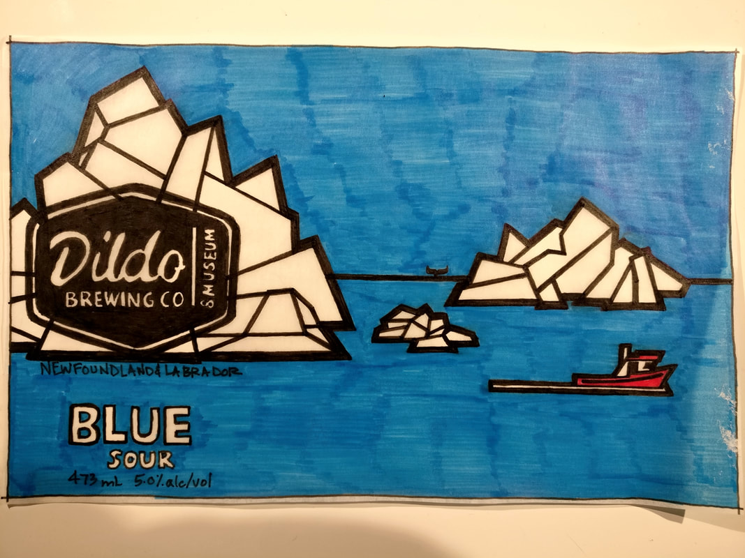 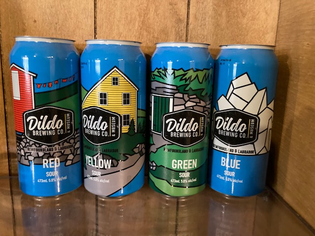 
1 Comment
TH
11/7/2023 09:02:11 am
test Leave a Reply. |
TroyPictures and words Archives
December 2022
Categories |
 RSS Feed